Challenge
In a highly codified beer category, the challenge was to create an identity that feels premium without losing impact. We needed to move beyond traditional brewery codes and build a simple, proprietary and instantly identifiable sign.
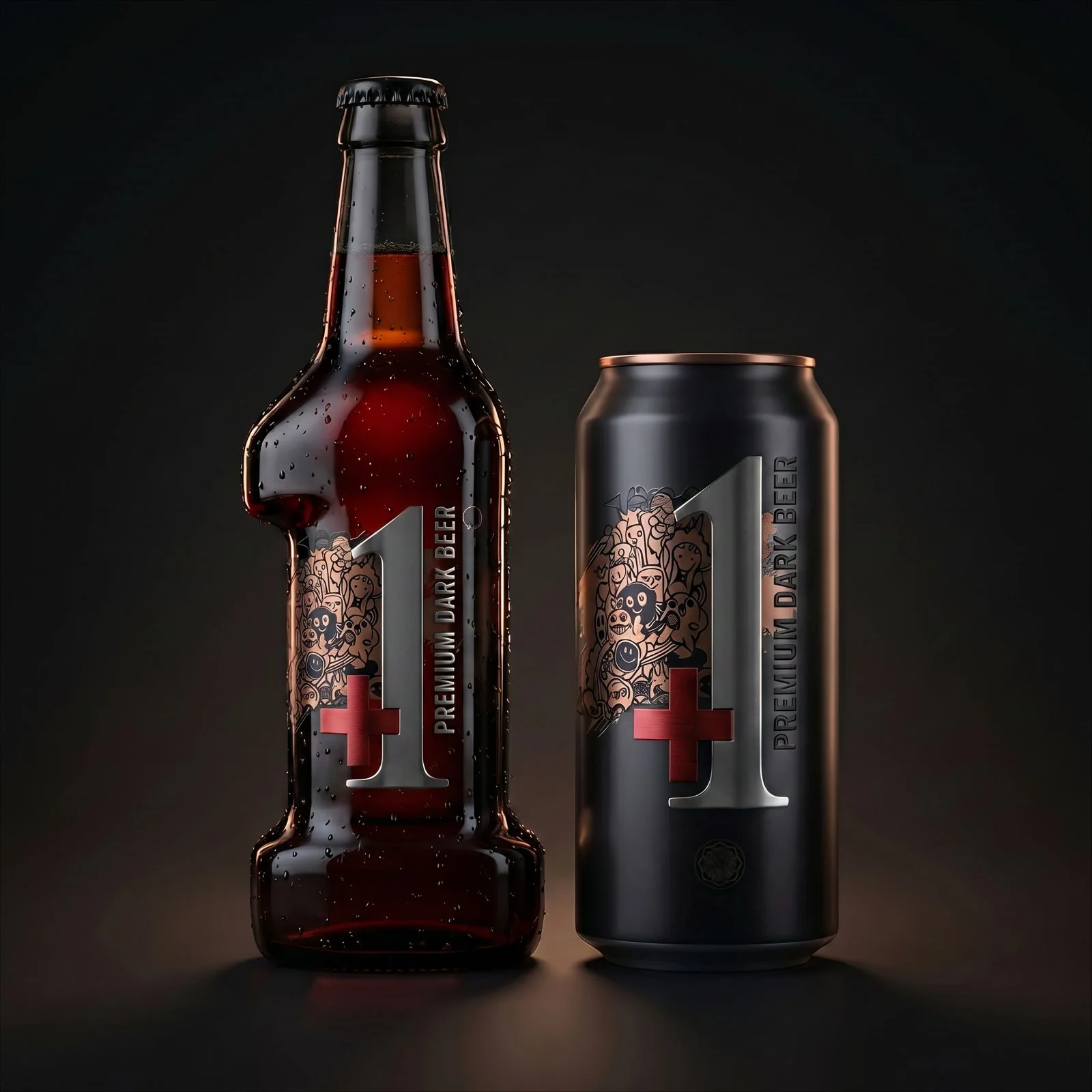
Premium dark beer
A simple sign becomes a product icon: +1, the beer that takes the experience one level higher.
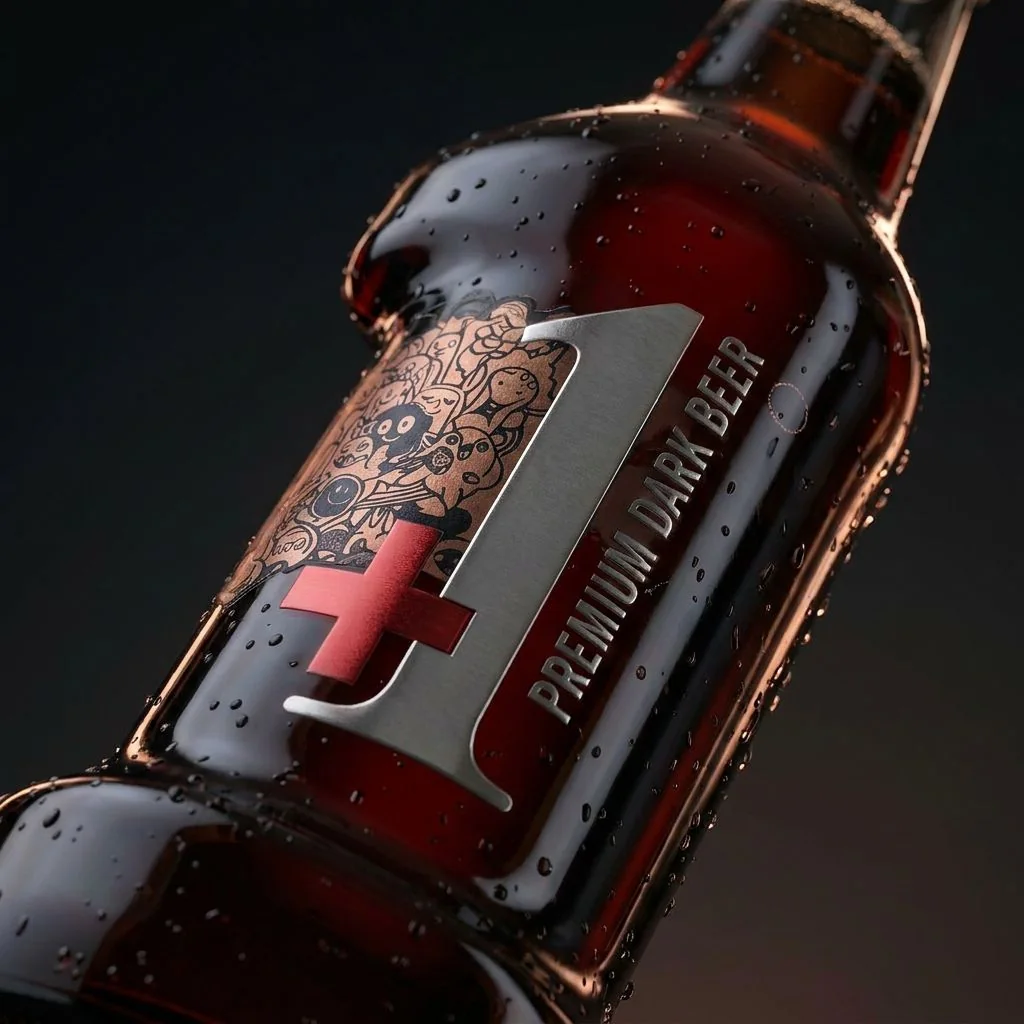
Label impact
The number becomes architecture: metal, contrast and illustration build a powerful presence.
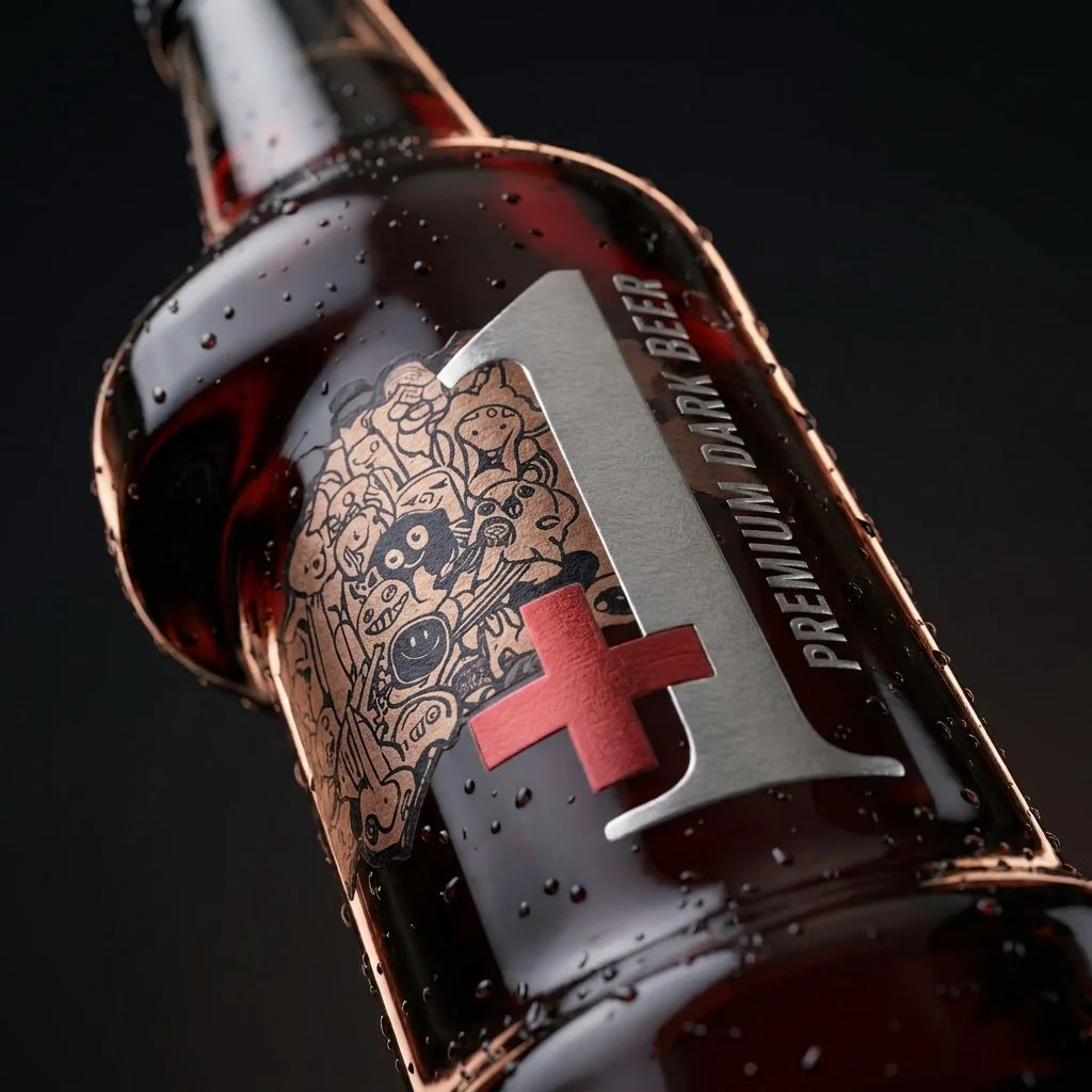
Material tension
The bottle plays with the tension between dark glass, cold droplets and dense graphic detail.
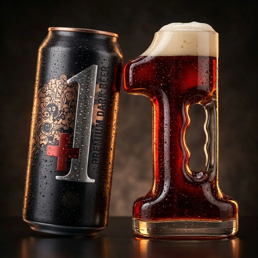
Product ritual
Can, sculptural glassware and foam create a highly distinctive drinking ritual.
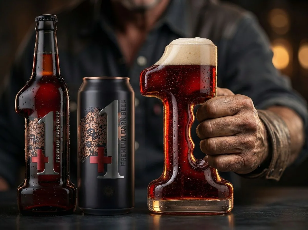
Serving attitude
The design leaves the packshot and finds its natural setting: the hand, the bar and the moment of service.
A premium beer conceived as one level above: iconic form, a strong attitude and instantly recognisable packaging.
+1
DCD
DATEM
Packaging design
Brand identity
Art direction & CGI
+1 turns a universal sign into a brand promise: add something, step up, choose a more intense experience. Packaging gives the symbol a sculptural, premium and memorable presence across bottle and can, within a dark, metallic and assertive world.
Presented as a project where packaging design turns a simple symbol into a powerful brand territory, +1 has also been featured by recognised design media.
+1 builds a premium beer brand around one clear idea: drink differently, with more intensity, more character and more presence. The number becomes a recognition cue, a packaging form and a brand attitude.
In a highly codified beer category, the challenge was to create an identity that feels premium without losing impact. We needed to move beyond traditional brewery codes and build a simple, proprietary and instantly identifiable sign.
We made “+1” the heart of the system: a strong graphic symbol, an iconic packaging silhouette, a dark metallic palette, red details and art direction that gives the product a more prestigious presence.
+1 gains memorability, desirability and perceived value. The brand becomes more recognisable on shelf and in imagery, with a premium territory that communicates the step-up at first glance.
The DCD method identifies the market’s key signals: shelf impact, memorability of the sign, premium status, differentiation from traditional beer codes and consistency across bottle, can and communications. DATEM translates these signals into visual emotions: power, depth, rarity, intensity and desirability. The Data Creative Analyst links analysis to execution by guiding packaging form, contrast, metallic materials, red details and the presence of the number as a central brand asset.
Our expertise confirms a core belief: good packaging design does more than dress a product; it turns data, strategy and emotion into value that is clear, memorable and desirable.
BACK TO PORTFOLIOThis project illustrates our holistic approach to brand design: strategy, visual identity, art direction and consistent rollout across touchpoints.